Metis
A consumer solar brand with a whole new energy.
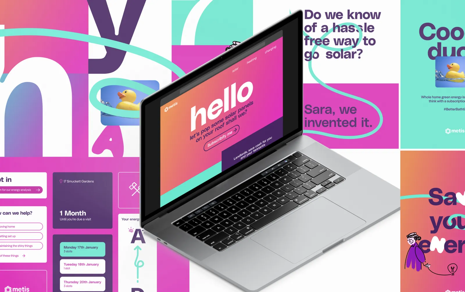
Making a splash in the UK’s crowded renewable energy market takes a brand that can cut through, and a way of explaining a renewable energy subscription that feels nothing like an energy company. Metis came to us early: there was a business plan and some initial brand thinking, but nothing that would stand out to customers who already had plenty of choice.
We treated the brand and the service as one design problem. The identity was developed alongside a service design process, so that what the brand promised was built into the end-to-end service from the start rather than bolted on afterwards.
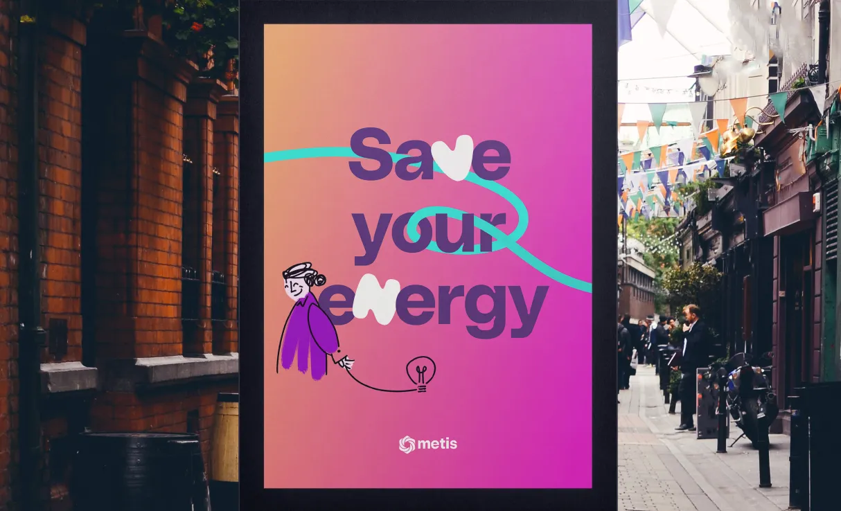
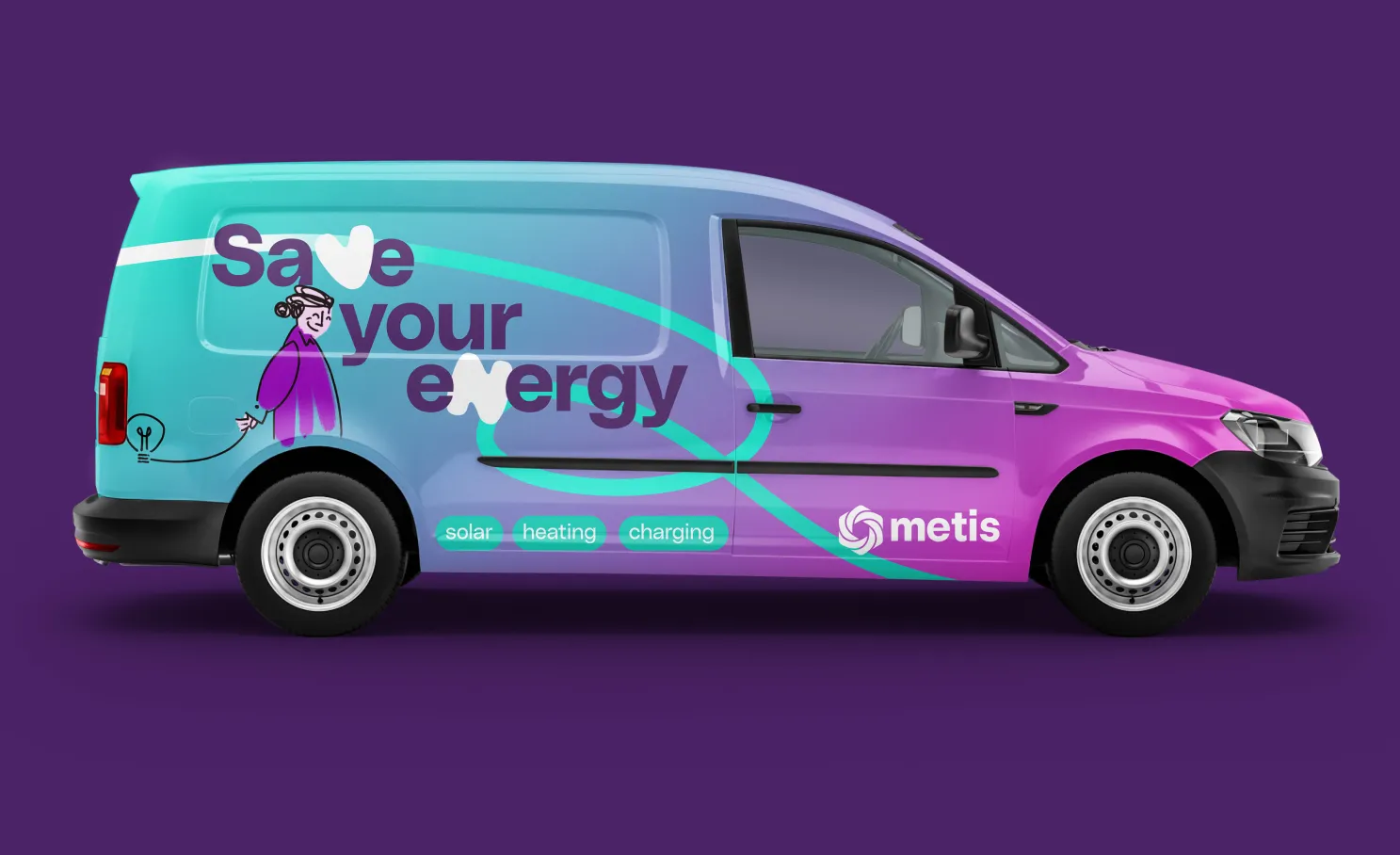
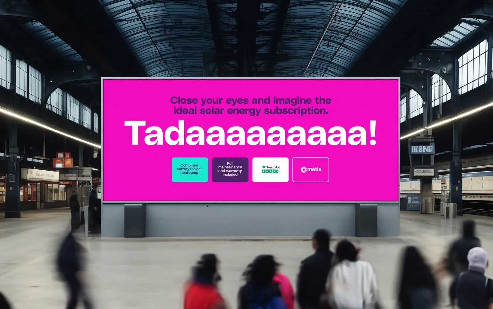
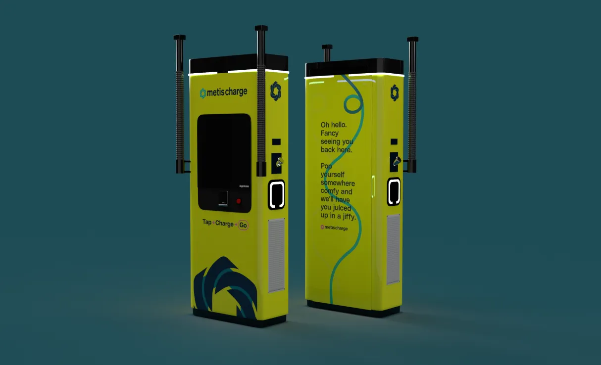
The voice does a lot of the work. Energy is a market where prices swing, profits look like greed and customers seem to come last, so Metis talks like the antidote: warm, plain, confident, and able to flex to the character of hundreds of local areas, with a type-driven identity to carry it. Metis also planned a nationwide fast-charging network, so we defined a set of modifying attributes that let MetisCharge carry a different proposition and a slightly different tone without breaking from the core brand.
The result is a brand built to stand out in a market tired of economic uncertainty, bad corporate behaviour and noise.
A brand is a promise the service has to keep. Design the two together, or the promise breaks.